Thinking Collective
All work

01 · Movement apparel

Kinesis

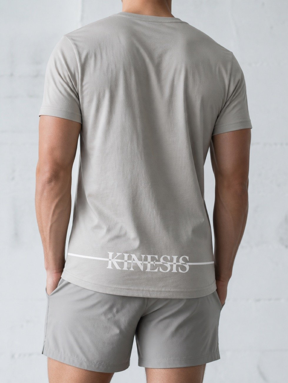
A movement apparel brand with one structural idea, held so consistently that the idea becomes the identity: a horizontal rule struck through the wordmark, repeated at the same height in every composition it appears in.

Client
Kinesis
Sector
Movement & apparel
Engagement
Identity sprint + campaign build
Scope
Identity, governance, campaign, packaging, motion
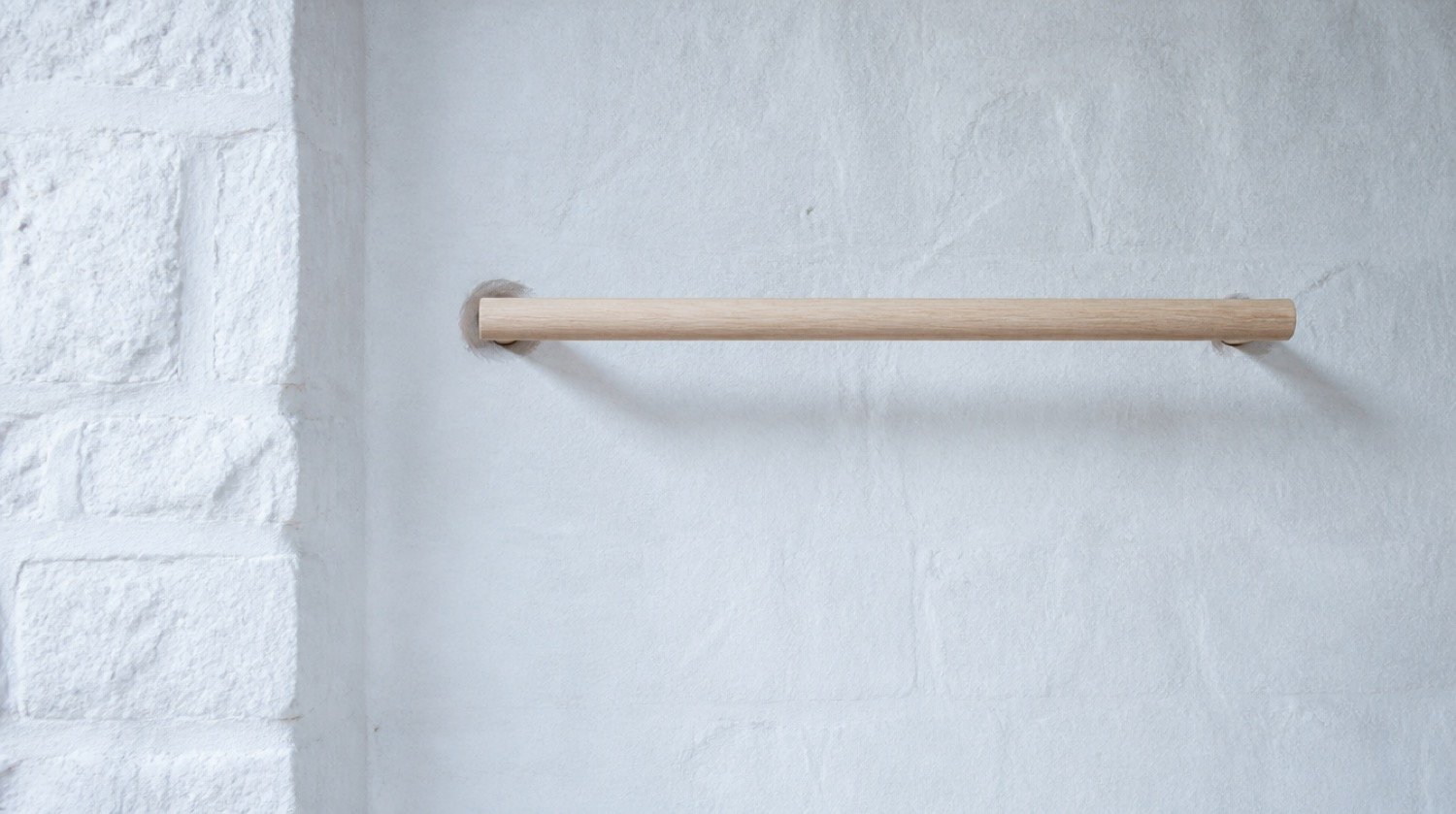
A wall-mounted wooden rail against a limewashed studio wall, styled as architecture rather than gym equipment.
AI Environment plate. Equipment framed as architecture. A rail reads as a lintel, never as gear.

The brief

Disrupting the culture of calisthenics.

Calisthenics has settled on a single look. Rubber flooring, hard overhead light, chalk dust, exposed concrete, and a grunge finish laid over all of it. Scroll the category and the brands are hard to tell apart.

Kinesis sells the opposite proposition. No machines, no loading, no equipment at all beyond the body doing the work. The founders arrived with a line that already said it: the only equipment is you. Nothing in the category's imagery reflected that.

So the identity was built against the category rather than into it. Cool morning light in place of hard gym light. Limewashed walls and stone in place of rubber and mirror. Empty rooms with air around the figure, and a mark quiet enough that the body stays the subject.

The mark

One device holds it together.

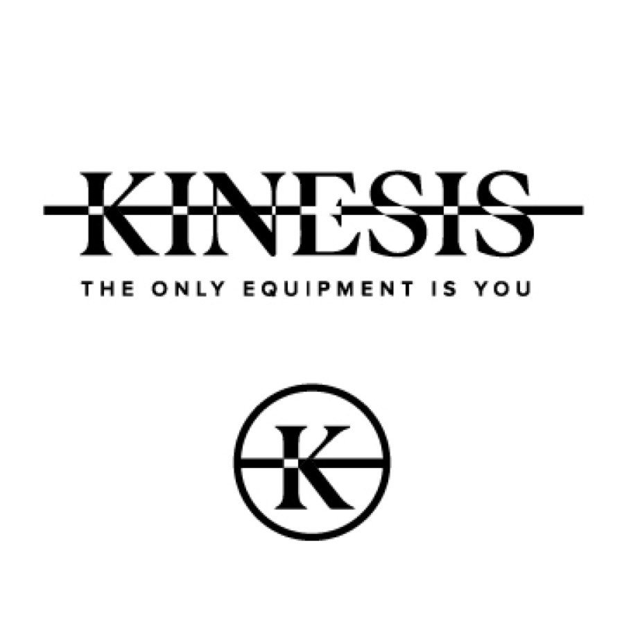
A high-contrast serif set in caps, struck through at cap-height by a single horizontal rule. Without the line, the wordmark is just a serif in capitals. The line is the identity.

With the rule

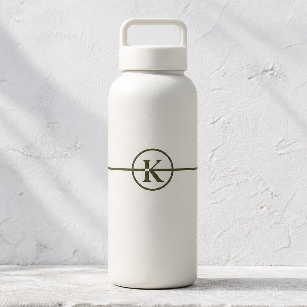
The Kinesis wordmark struck through by a horizontal rule, shown above the circular K monogram in which the same rule cuts across the letterform.
Organic The mark, and the monogram it reduces to. The rule survives down to a single letter.

Without it

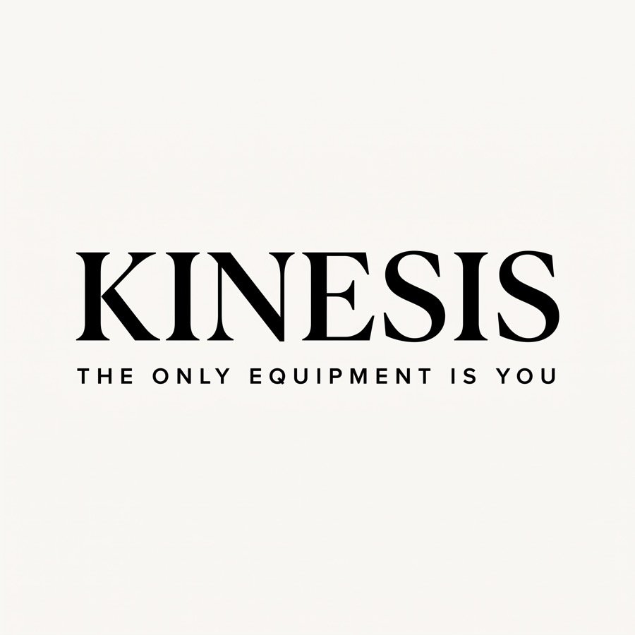
The same Kinesis wordmark and tagline with the horizontal rule removed, leaving plain serif capitals.
Organic The same artwork with the rule removed. A serif in capitals, and nothing else.

The system

Six values, each with a job.

Drawn from cool morning light on limewashed stone. Bright and open, never warm or moody. Warm the palette and it becomes a different brand. Each value carries a written usage rule, not just a hex.

Limewash#F2EFE9 Primary ground
Bone#E4DED2 Linen, apparel
Stone#C6BEB0 Rules, borders
Morning#9FB3BE Shadow, glass
Olive#5F6B52 One accent, sparing
Ink#14140F The mark, and type

Governance

The guide lists what breaks it.

Most brand guides only show the correct version. This one also names the six ways the identity gets broken, because those are the things that actually happen once the files reach a printer, a manufacturer, or a new hire.

  • Warming the palette
  • Removing the strike line
  • Stretching or outlining the mark
  • Crowding it past the clearspace minimum
  • Rebuilding the mark in live text
  • Letting gym signals back into the photography

Clearspace is set against the artwork instead of a fixed measurement. It equals the height of the K on every side, so the rule holds at any scale it is applied at.

Application

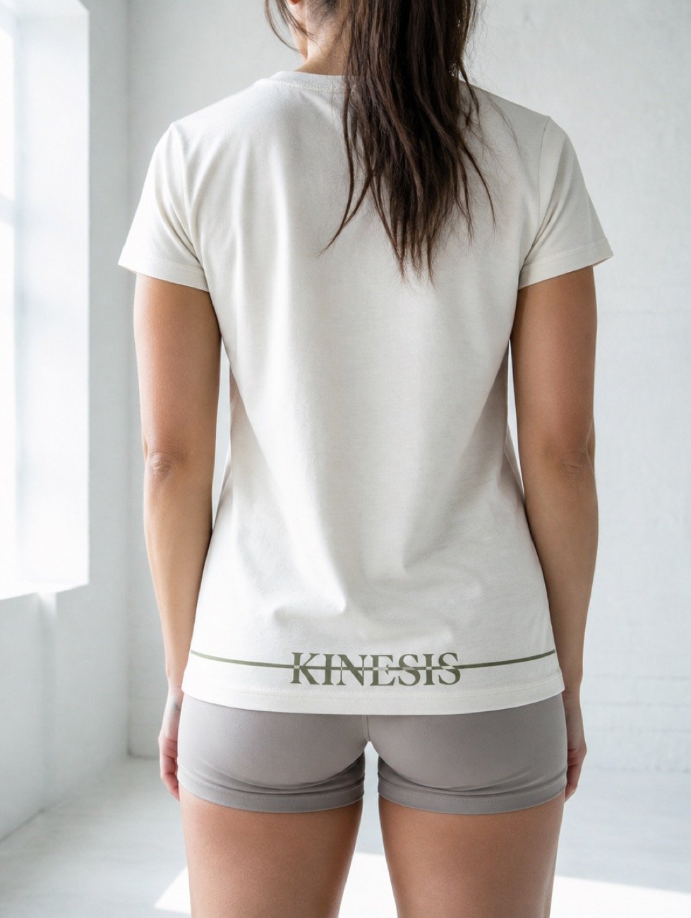
The line, at garment scale.

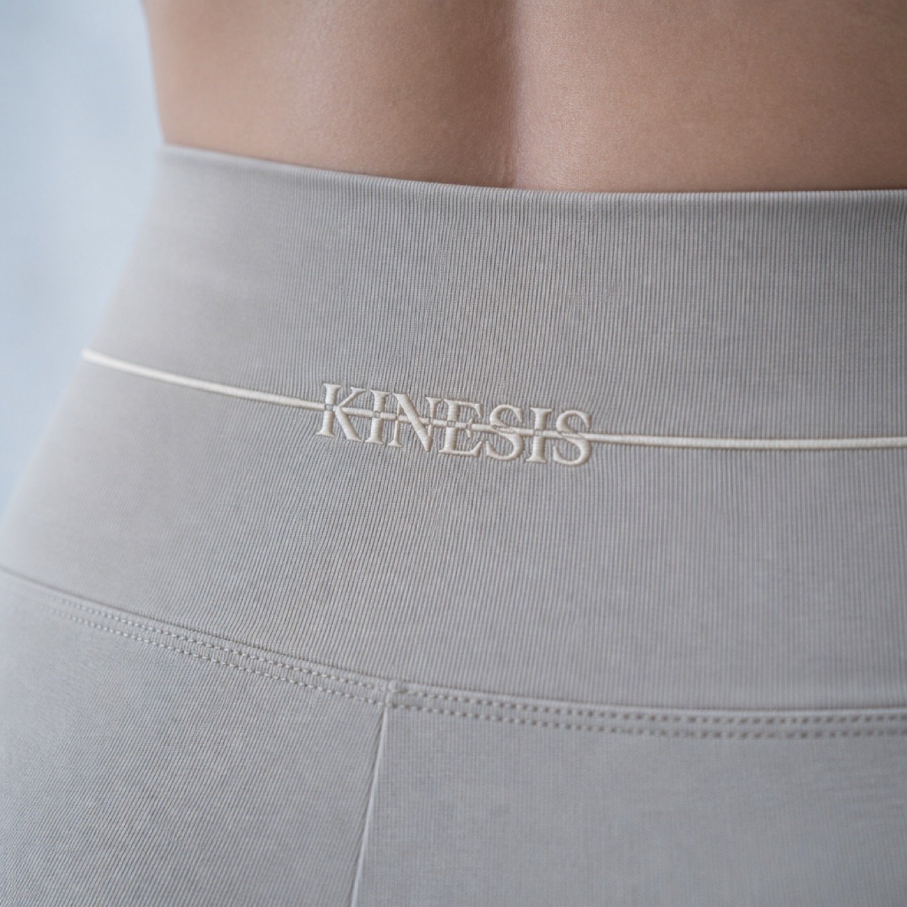
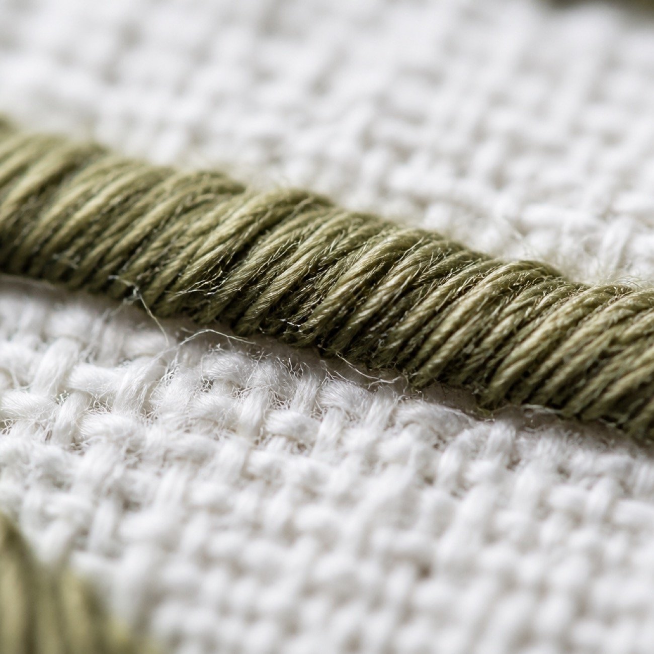
The device had to survive being embroidered, heat-pressed, woven into a waistband and stitched at 2mm. Every application holds the rule at the same relationship to the letterform.

Campaign

The body is the subject. Never the face.

Soft cool daylight, blue-white rather than golden. Limewashed backgrounds, empty. Subjects turn three-quarter or away from camera, so it's the line of the body that carries the frame.

The constraint

The shoot they could not afford.

Kinesis wanted the launch shot with real models. A studio, a crew, a full day, both genders, five colourways, and detail frames for every product in the range. The quotes came back higher than the entire launch budget.

The usual answer is to shrink the campaign. Fewer looks, one gender, no motion, and a launch that looks smaller than the brand it is selling.

We did it the other way round. The mark, the palette and the written system were built by hand first, so there was something exact to art direct against. The campaign library was then produced generatively, frame by frame, and cut down hard against that system.
Shoot days Zero
Usable frames Forty and up
Ready Before samples existed

No day rate, no crew, no location fee, no model release, and no reshoot when a colourway moved. Kinesis had sell-in imagery months before inventory landed, and enough of it to run social, wholesale and web from launch day. If the campaign you need is larger than the budget you have, that is the work to talk to us about.

Start a conversation

Sequence & motion

Boarded, then moved.

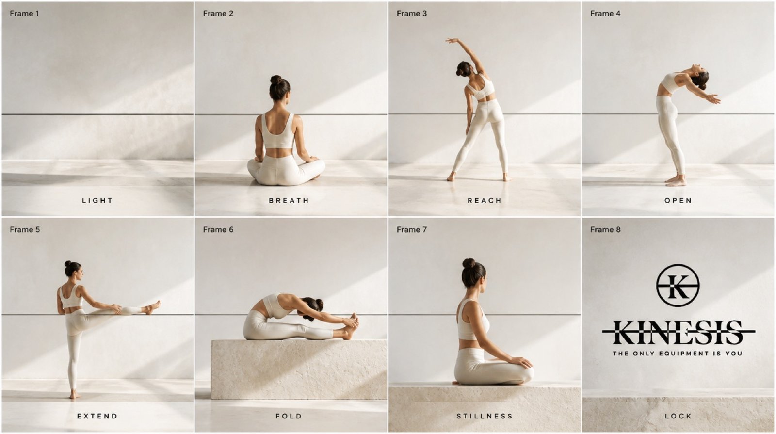
An eight-frame sequence board set the pacing before anything was animated, the same discipline a live shoot would demand, at none of its cost.

Asset ledger

What was drawn, and what was generated.

Every asset delivered on this project, sorted by how it was produced. Kinesis owns original vector artwork and a written system; the campaign library around it was generated, art-directed and culled.

Organic, hand-built 7 deliverables

  • Wordmark with strike-line device · vector
  • Circular K monogram · vector
  • Lockup suite and clearspace rules
  • Six-value palette with per-value usage rules
  • Typographic system and substitution policy
  • Brand board and written governance
  • Failure-mode documentation

AI, generative production 7 deliverables

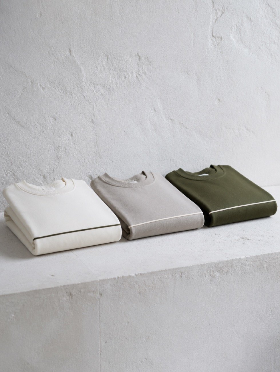
  • On-body campaign photography · men's and women's
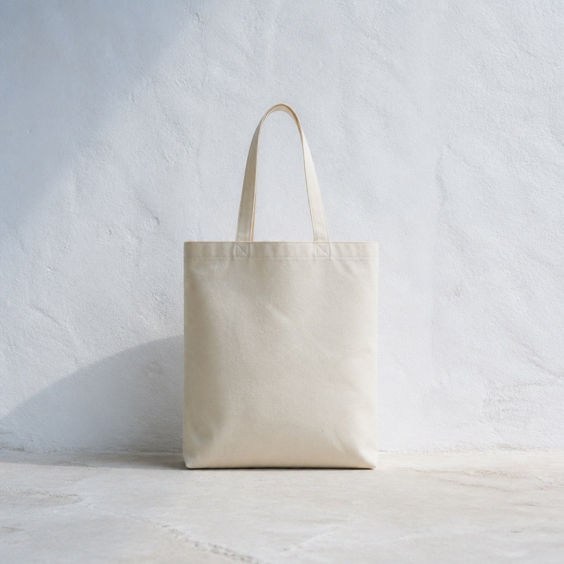
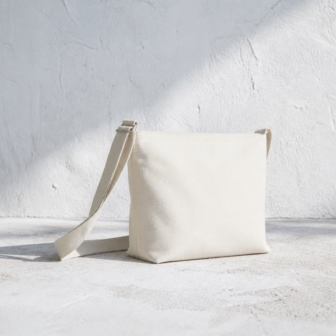
  • Product and accessory imagery · tote, bottle, bag
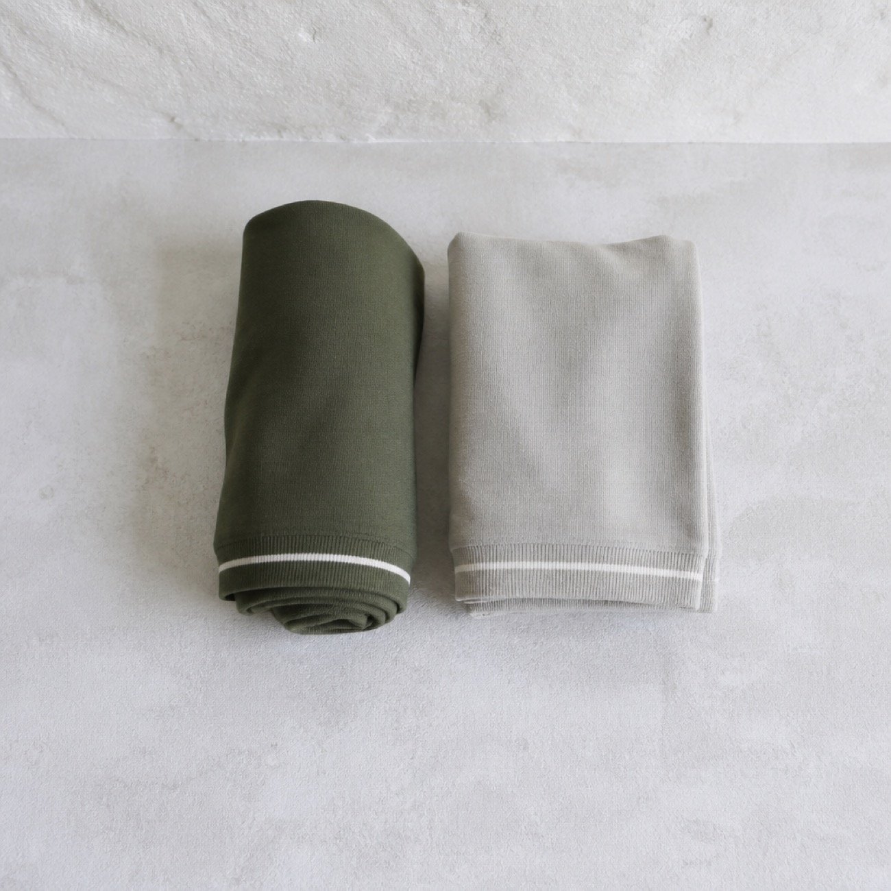
  • Detail and macro · waistband, hem, stitch
  • Colourway and range exploration
  • Eight-frame yoga sequence storyboard
  • Studio motion · wall rail sequence
  • Environment and backdrop plates

What the organic work bought

Quality type
Deliberate. The strike line is a defensible decision, not a texture. It scales from a 2mm embroidered hem tag to a storefront window without redrawing.
  • Original artwork Kinesis owns outright and can register.
  • Vector files a manufacturer, embroiderer and printer can all work from unaltered.
  • A written system that survives the founders, so their next hire extends it without a briefing.
  • Named failure modes, so drift gets caught in proofing rather than in production.

What the generative work bought

Quality type
Volumetric. A complete campaign library covering both genders, five colourways, on-body, flat-lay, macro and motion, built before a single production sample existed.
  • Sell-in imagery ready months before inventory landed.
  • No studio day rate, no model release, no location, and no reshoot when a colourway moved.
  • The cool-light direction was proven across forty frames before it was committed to the board.
  • Range exploration made the palette decision evidential rather than theoretical.

The mark is drawn. The world around it is generated. Neither pretends to be the other.

Thinking Collective · production policy