A sushi restaurant and the chef school that shares its roof. One crest,
one calligraphic wordmark, and a sub-brand architecture that lets the
Academy speak with the authority of a credential without ever leaving the
house it came from.
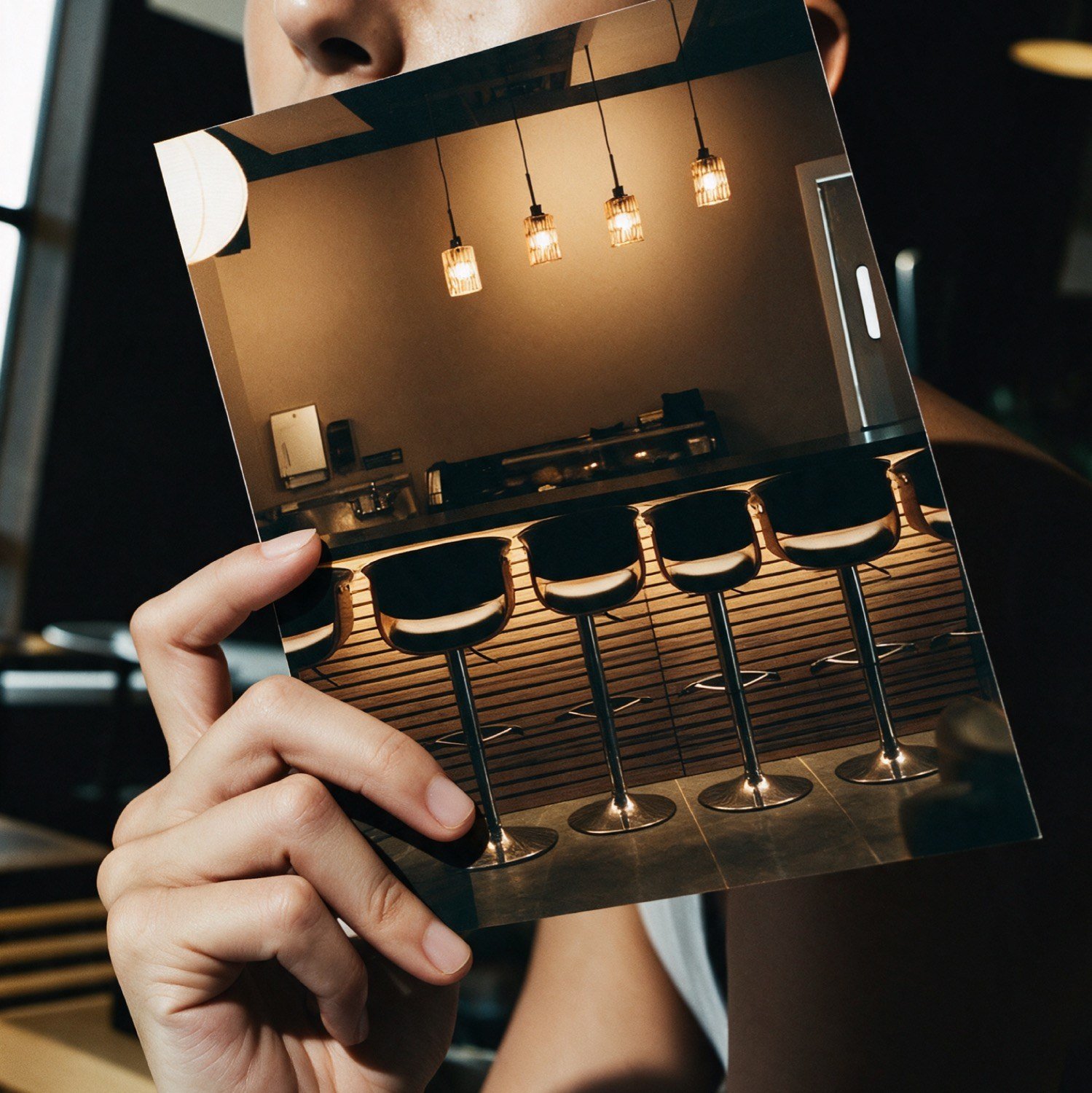
AIIn-situ visualisation. The printed pamphlet, checked against the room it would actually be read in.
The brief
Three businesses, one roof.
Sushi Dojo is a restaurant in Boca Raton. Sushi Academy trains
professional chefs. Sushi Chef School teaches everyone else. All three
run out of the same building under the same founder, and all three
arrived at once.
The asset list was long. A crest and wordmark able to sit on a dinner
menu and on a graduation certificate. A sub-brand system so each school
could be told apart from the restaurant and from the other school.
Menus, pamphlets, banners, window decals, chef coats, T-shirts, stamps,
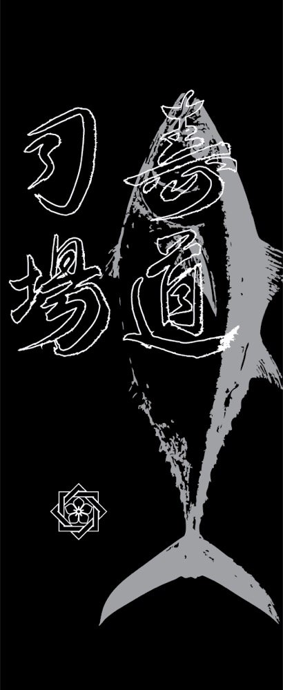
and the artwork for a wall-mounted knife case.
Two more lines followed once the identity was settled: a retail
experience for the knives sold on site, and a premium take-out offer.
Every piece of it was designed here.
The mark
A logo that holds tradition, with innovation.
The crest is constructed and the wordmark is not. Setting them together
is the whole idea: one part carries the lineage, the other carries the
hand.
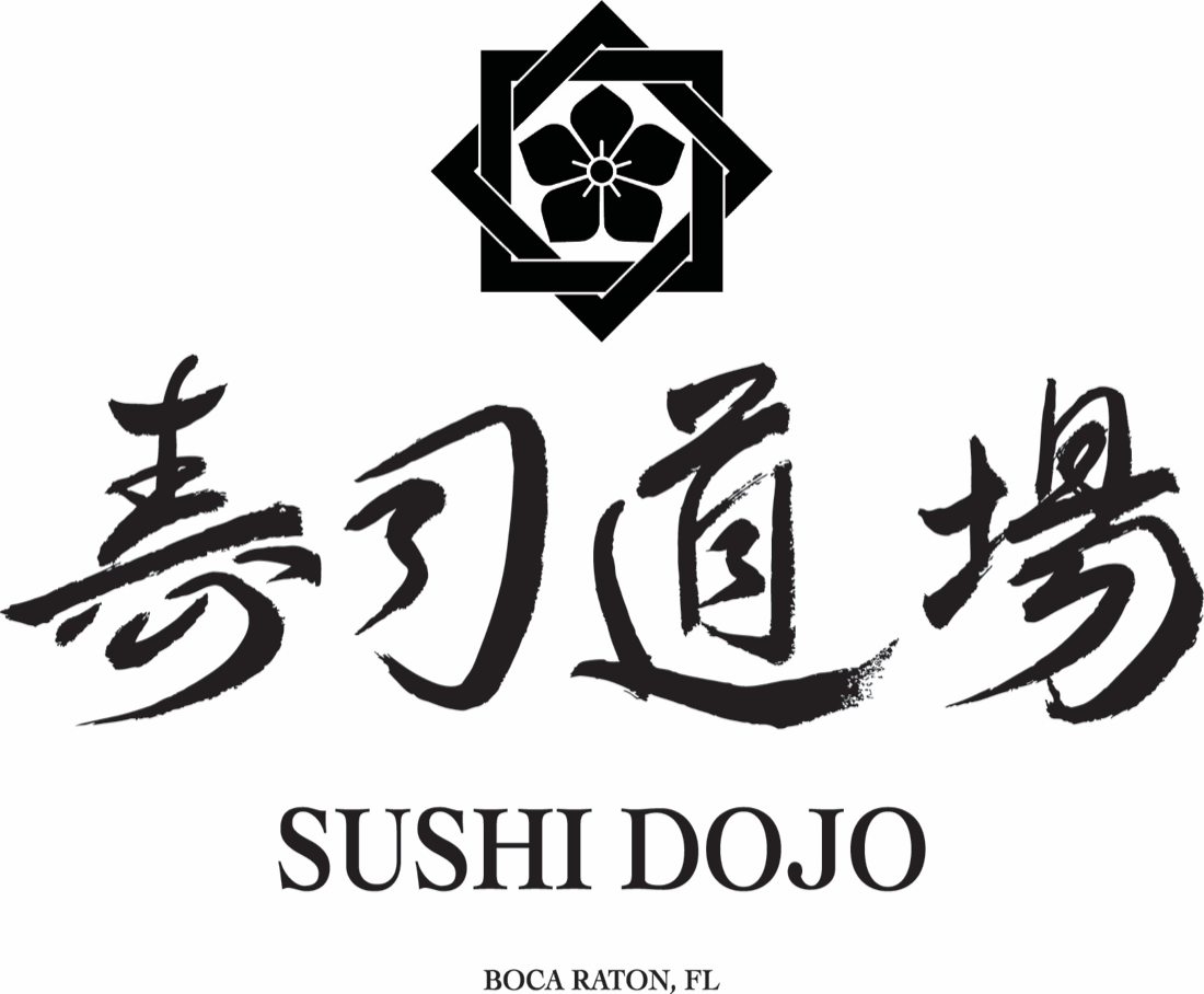
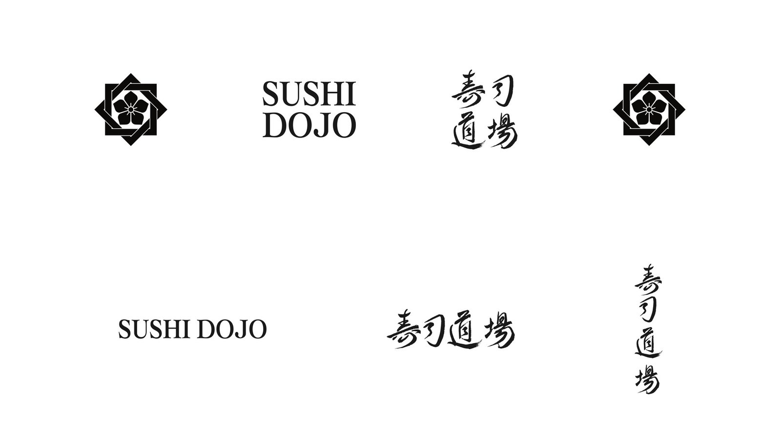
OrganicPrimary lockup · crest, calligraphy, locality line
The crest
Constructed vector. Rotated squares on a grid around a five petal
kamon, symmetrical enough to reduce to a 12mm inked seal.
The calligraphy
寿司道場, brushed by hand. It repeats none of the crest's geometry.
It is placed as artwork and never retyped or redrawn.
The locality line
Boca Raton, FL sits inside the primary lockup rather than in a
footer, so the claim is stated up front on a menu, a window and a
certificate alike.
Sub-brand architecture
How the three marks relate.
Three businesses need three marks that read as related without being
interchangeable. The system separates them by how far each one sits from
the restaurant.
Sushi Dojo holds the primary crest and the brushed wordmark. Sushi
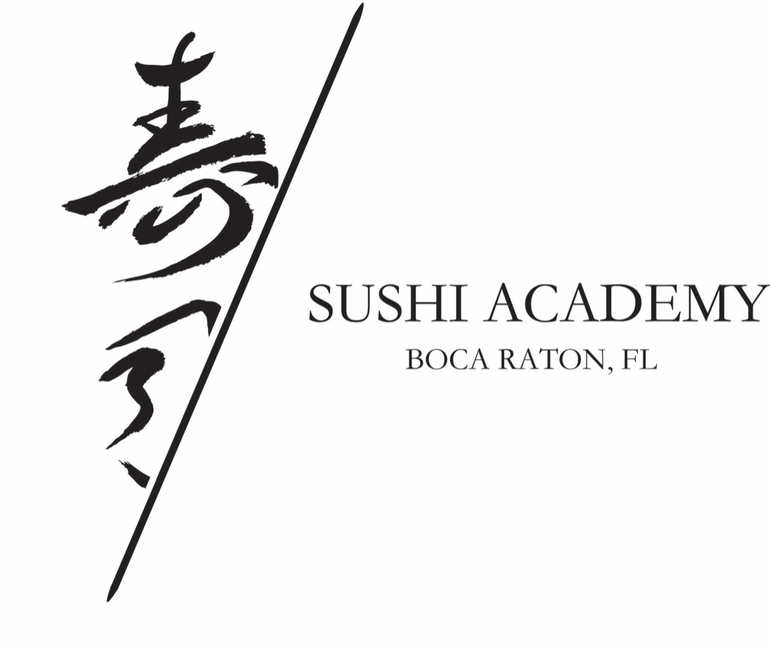
Academy uses the same calligraphy cut with a diagonal rule, so it reads
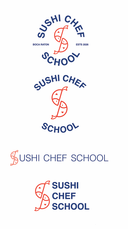
as the same house in a different register. Sushi Chef School sits
furthest out, on a fish form monogram with its own palette, pattern and
badge set, because it sells to a general audience rather than to working
chefs.
OrganicSushi Academy · house calligraphy, cut with a diagonal rule
OrganicSushi Chef School · badge, horizontal and stacked lockups
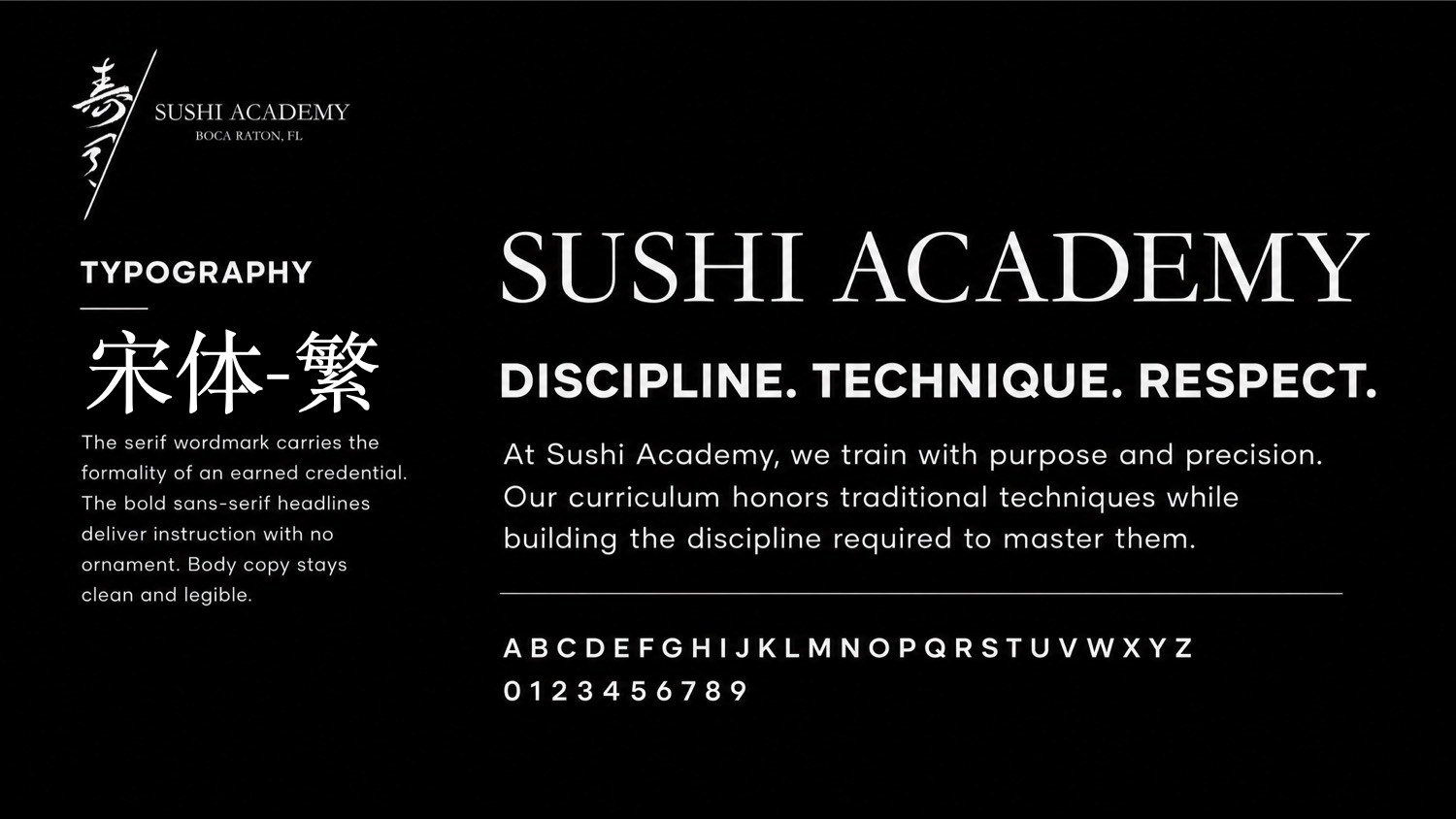
OrganicTypographic system. The serif wordmark carries the formality of an earned credential; bold sans headlines deliver instruction with no ornament.
Brand buildout
The system, page by page.
The Chef School system was documented so it can be applied without us
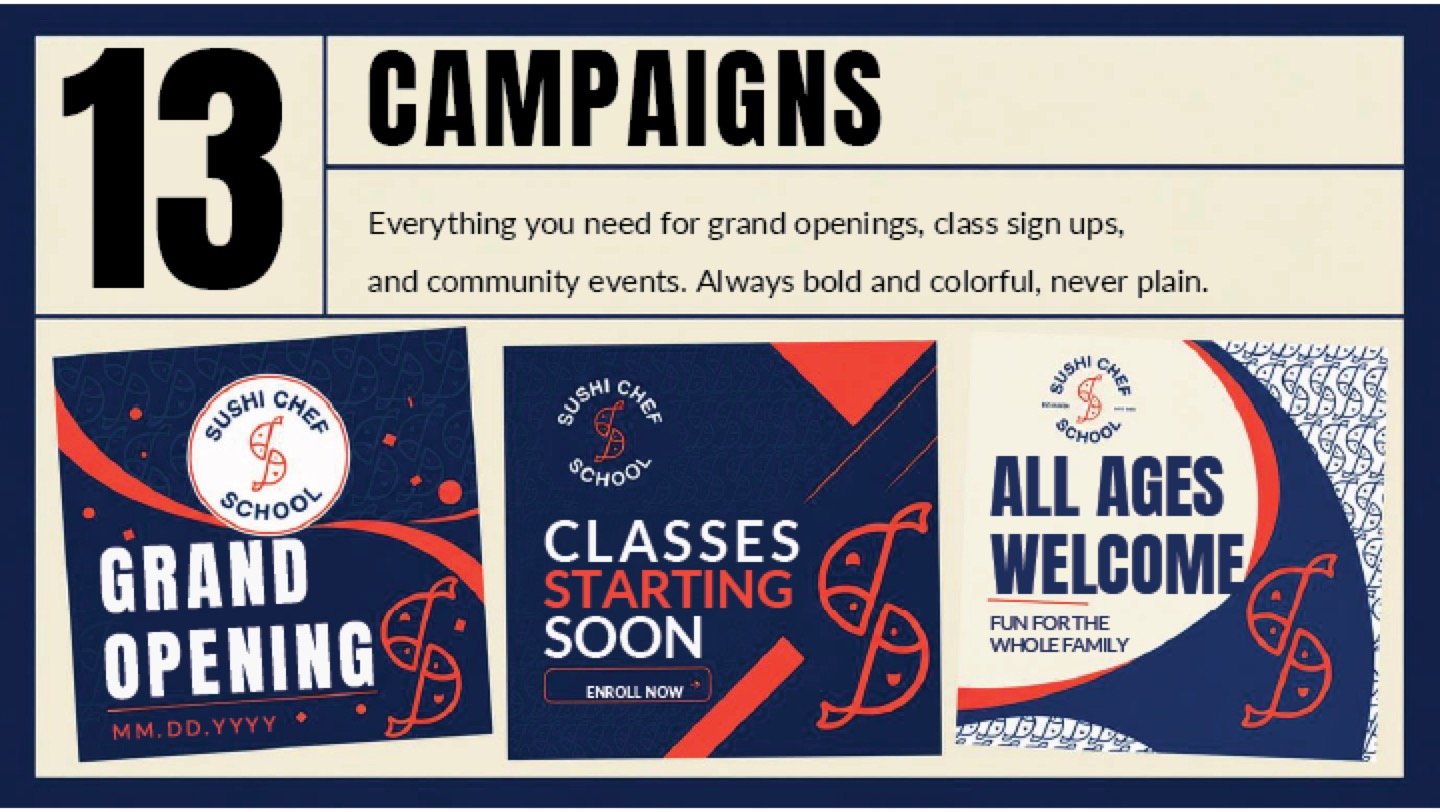
in the room. Pattern, print, signage, apparel and campaign layouts,
each with the rules for using them.
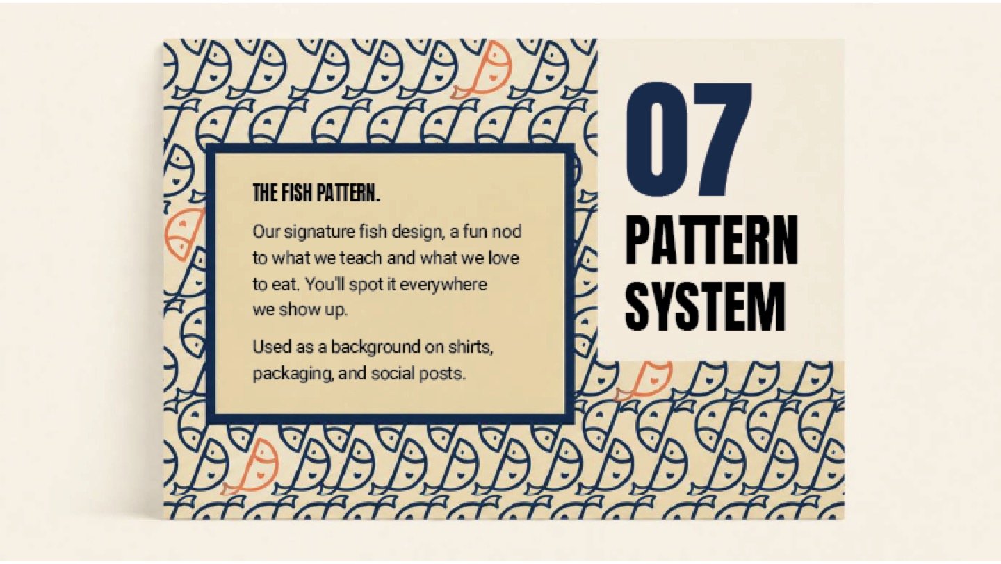
OrganicPattern system
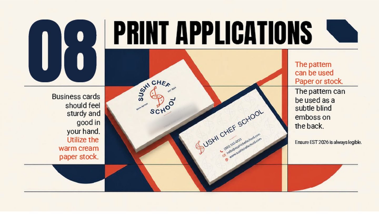
OrganicPrint applications
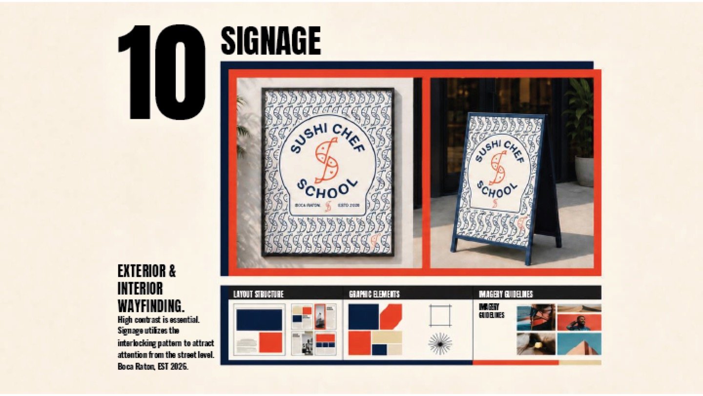
OrganicSignage and wayfinding
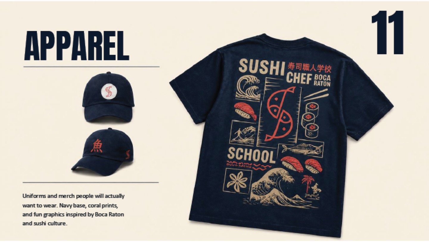
OrganicApparel and merchandise
OrganicCampaign layouts for grand openings, class sign-ups and community events.
Print
Where the identity earns its keep.
A menu is read at arm's length in low light by someone deciding how
much to spend. It's the least forgiving surface a hospitality brand
owns, and the first place a weak system shows.
OrganicBanner · crest in gold on green
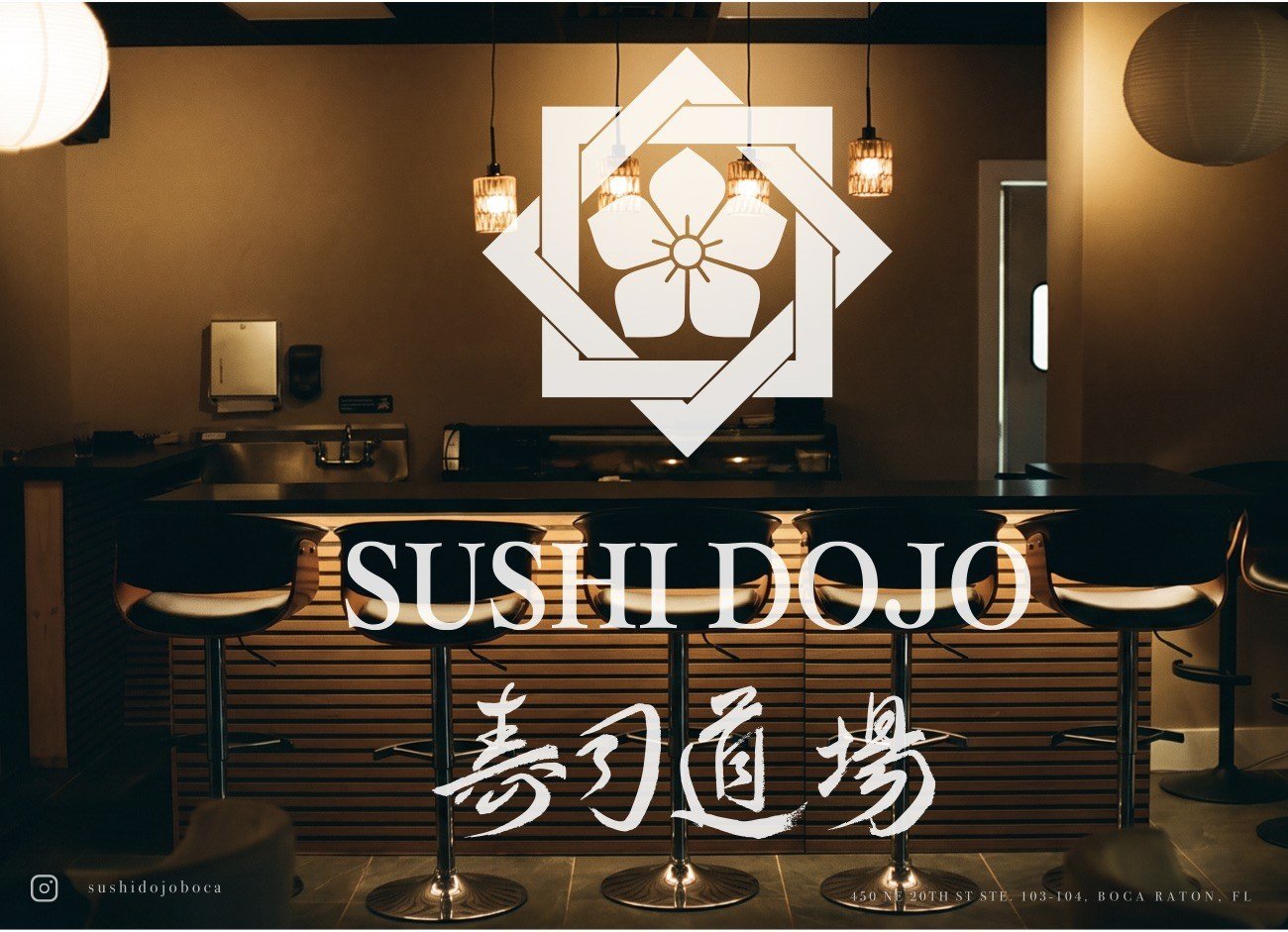
OrganicPamphlet · artwork
OrganicTuna panel · calligraphy in outline over the fish
OrganicStamp suite, seven lockups. The crest, the wordmark and the kanji in square, horizontal and vertical
formats, so one of them fits a takeaway box, a receipt, or a student's completed workbook.
Worn & environmental
The parts a customer walks past, or is served by.
Uniform, glass and wall. These are the applications that decide whether a
brand feels resident or applied, and they're the ones most identity
projects leave to whoever prints them.
OrganicChef coat · final production artwork
OrganicWindow decal · single-colour cut
AIDisplay wall · motion
The website
The identity, online.
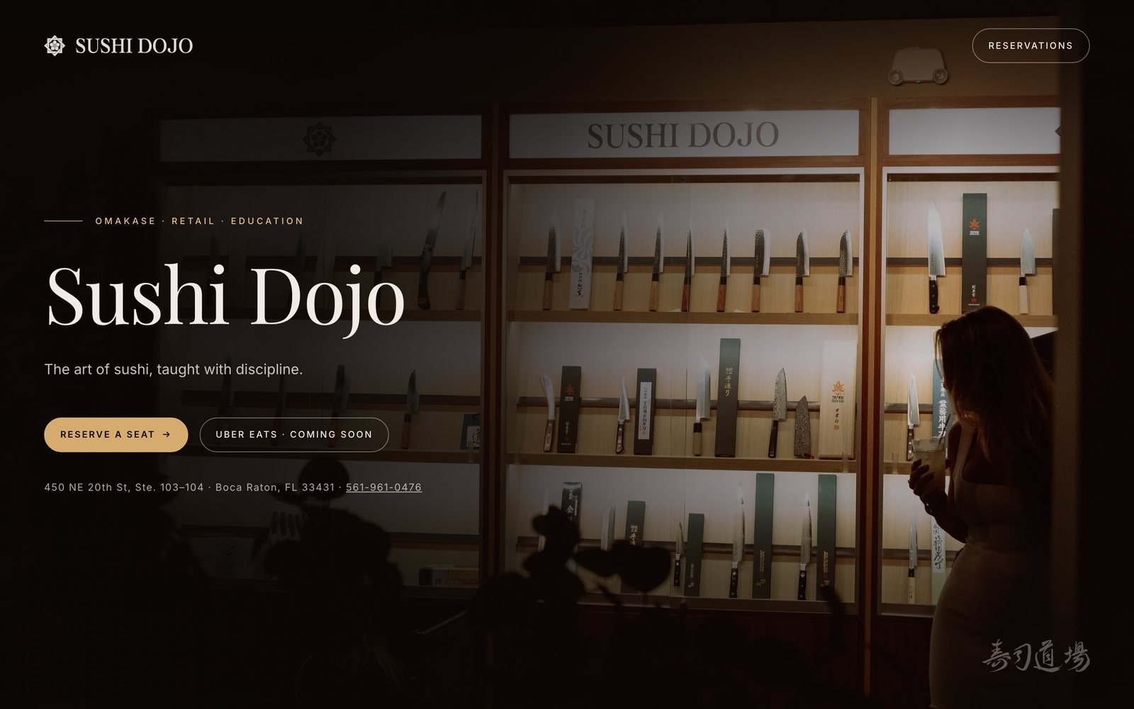
sushidojoboca.com was designed and built here. The same crest,
calligraphy and serif wordmark, carried onto a screen without
redrawing any of it.
sushidojoboca.com
OrganicDesigned and built as a single page. Everything a visitor needs sits in one view.
StructureOne page, no template
CarriesCrest, calligraphy, wordmark
In one viewOffer, booking, address, phone
Websites are part of what we make. If the identity
already exists, we put it online. If it does not, we build both, so the
site is not a separate design that happens to carry your logo.
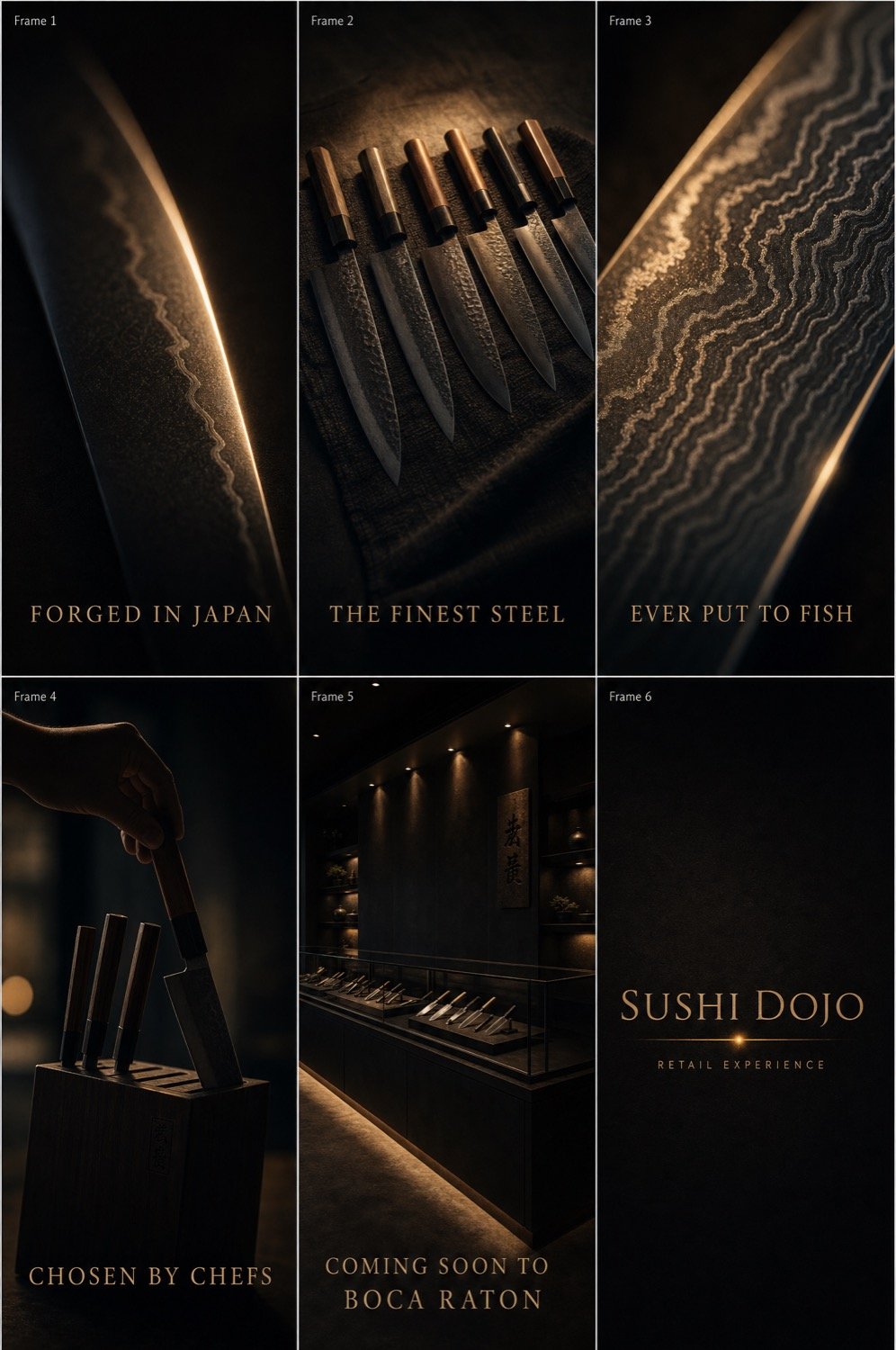
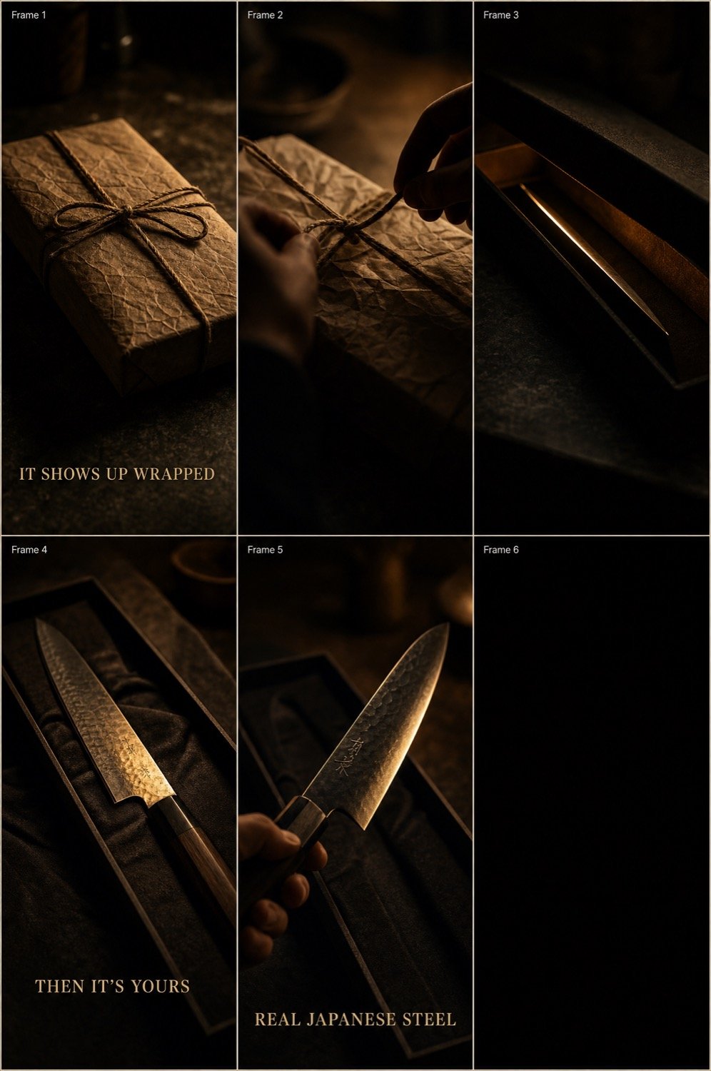
Two six-frame boards set the knife campaign before anything was
rendered, a product reveal and an unboxing. Then the display case
was taken into motion.
AIKnife campaign · six-frame board
AIUnboxing · six-frame board
AIKnife display case · motion
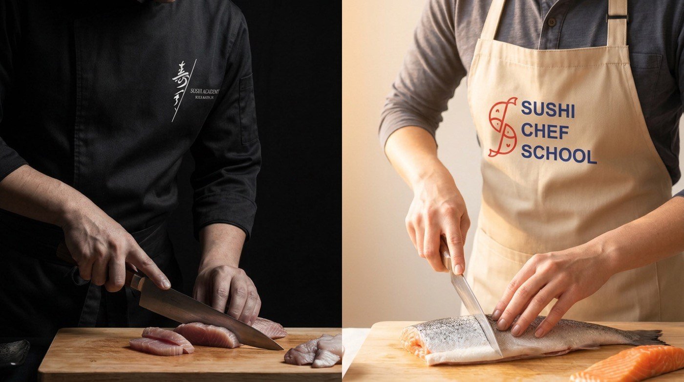
AIUniform in use. The Academy coat and the Chef School apron, shot as a pair for recruitment and sell-in.
Asset ledger
What was drawn, and what was generated.
This project sits heavily on the organic side. Almost everything Sushi
Dojo puts in a customer's hands is production artwork: vector, printed,
cut or embroidered. Generative work carried the campaign around it.
Organic, hand-built
15 deliverables
Kamon crest · constructed vector
Calligraphic 寿司道場 wordmark treatment
Primary lockup with locality line
Sushi Academy sub-brand system
Sushi Chef School monogram, pattern and badge system
Chef School buildout pages · pattern, print, signage, apparel, campaigns
Website design and build · sushidojoboca.com
Typographic system · serif, sans and body roles
Brand buildout deck · ten pages
Menu design and layout · nine pages
Pamphlet, banner suite and tuna panel artwork
Stamp suite · seven lockups
Chef panel · vector illustration for menu and collateral
Chef coat, T-shirt and wall art artwork
Window decal and knife display case panels
AI, generative production
4 deliverables
Uniform and counter photography
Knife campaign storyboard · six frames
Knife unboxing storyboard · six frames
Display case motion and in-situ mockups
What the organic work bought
Quality type
Deliberate. Every piece here has to survive a
physical process: a vinyl cutter, an embroidery head, a press. Only
true vector artwork with real production specification does that
without a phone call.
A crest that reduces to a 12mm inked seal and enlarges to an 80-inch banner from the same file.
Single-colour decal and embroidery artwork that vendors ran without amendment.
A sub-brand architecture that lets the Academy issue credentials in the family voice.
Menu artwork the kitchen can update seasonally without the layout drifting.
What the generative work bought
Quality type
Volumetric. Campaign, atmosphere and motion for a
single-location restaurant, at a cost that would otherwise have put
all three out of reach.
Two full campaign boards approved before any production spend was committed.
Print pieces checked in the actual room before going to press.
Academy recruitment imagery without booking students or a shoot day.
Motion for social · a format a single-site restaurant rarely gets to own.
Where we drew the line. Nothing a customer physically
receives was generated. The crest on the coat, the seal on the box, the
decal on the glass and the type on the menu are all drawn artwork with
production specification behind them, because a vinyl cutter, an
embroidery head and a press need real paths, not an image of one.